Vestry
A pre-launch site for a subscription that keeps a family's documents, wishes, and final arrangements in one place — designed to make a hard subject feel calm rather than morbid.
What we built
Vestry is a subscription for the documents, wishes, and final arrangements that keep a family whole — built while you're well, kept until they need it.
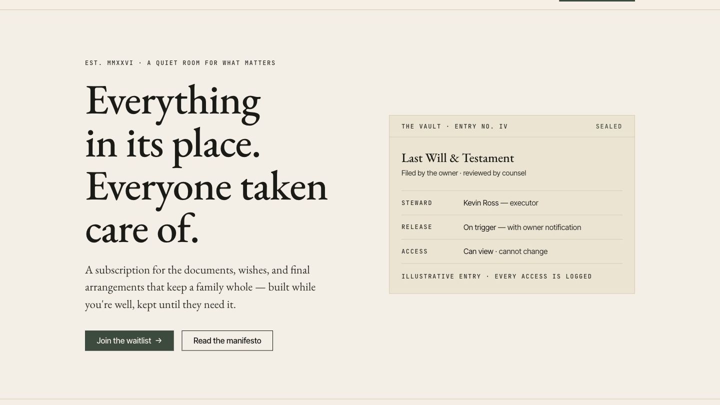
The design problem here is tone. Estate and end-of-life products usually pick one of two bad options: clinical and cold, or sentimental to the point of being maudlin. We went somewhere else — a quiet, editorial, almost archival feel. Serif type, warm paper tones, roman numerals, generous space. The site treats the subject as serious and ordinary rather than frightening.
How we built it
- Custom editorial design that reads calm instead of clinical or sentimental
- A concrete sample vault entry in the hero, so the abstract becomes tangible
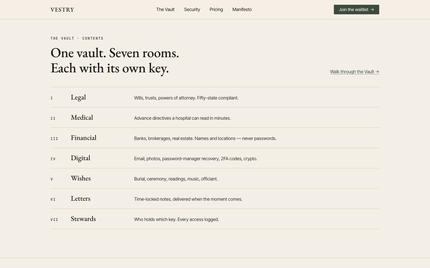
- The seven vault categories laid out as a plain index, not a feature grid
- Security given its own place in the navigation, where this audience looks
- Waitlist capture as the single action ahead of launch
What changed
Vestry has a site that earns trust before it asks for a subscription — the tone does the persuading, and the sample entry answers "what is this, exactly?" in the first screen.
More from this project.
Ready to get your business online?
Websites starting at $3,000. Delivered in under two weeks.
Get your free quote